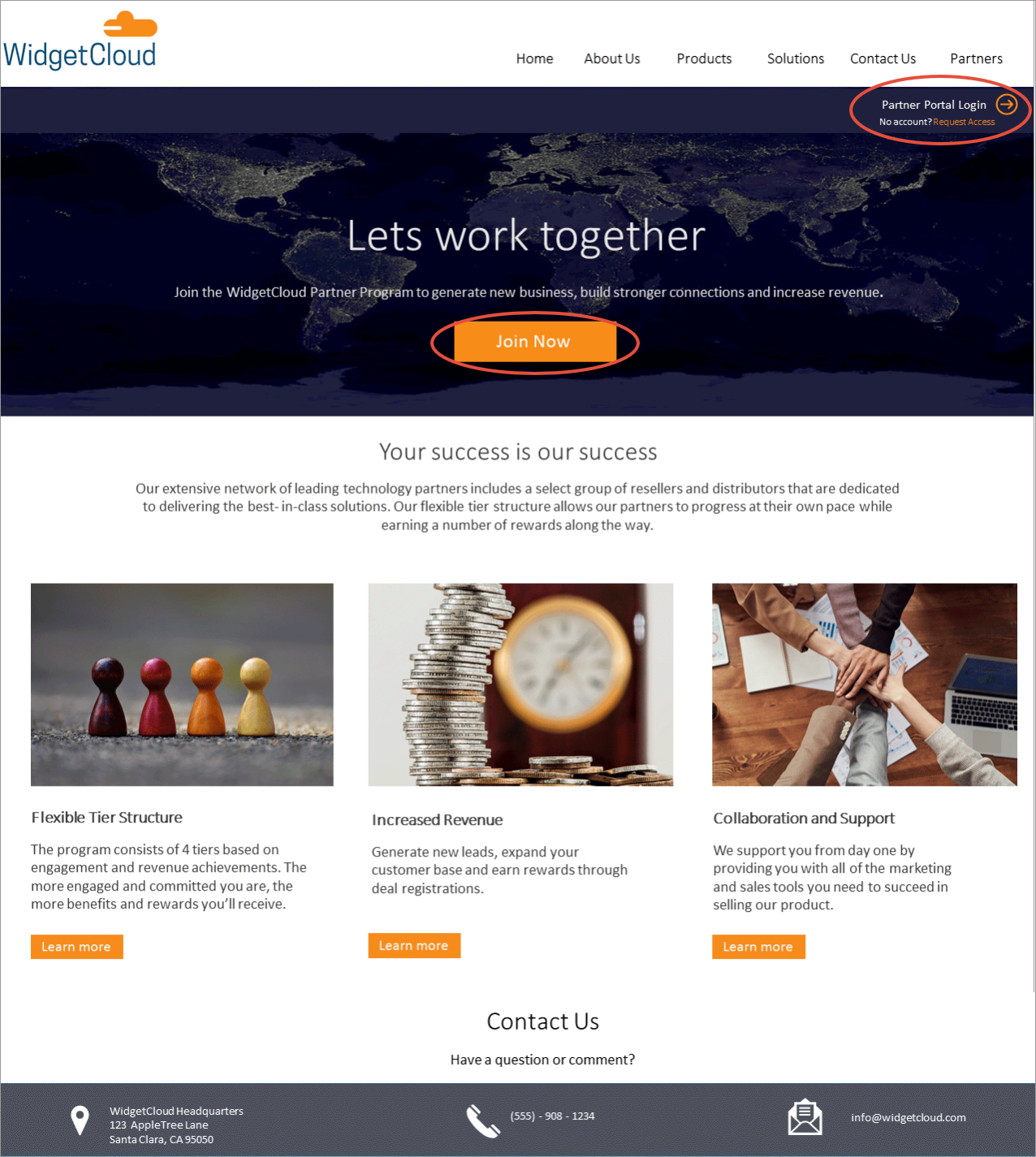
If you have a partner program, your corporate website should have a page dedicated to Partners.This page should be designed to direct existing partners and prospective partners down different paths. Existing partners should be provided a link to your partner portal login page and prospects should be provided with the details of your program that will help them determine if they are a fit.
Design and Content Tips:
Clear and concise navigation
- Include "Partners" in your top navigation
- Keep the page simple with straight forward calls-to-action (CTAs)
- Provide an overview of your partner program
- Explain your program's benefits and requirements
Make it obvious
- Make the partners page actionable
- Create a clear path for existing partners with one-click access to log in to your portal
- Provide prospects with one-click access to your Become a Partner form.
- Highlight your program benefits and requirements
- Include contact information
Providing a clear and concise partners page on your website will ensure partners and prospects have a good experience whether they are logging in for the first time or registering for your program.

Was this article helpful?
That’s Great!
Thank you for your feedback
Sorry! We couldn't be helpful
Thank you for your feedback
Feedback sent
We appreciate your effort and will try to fix the article